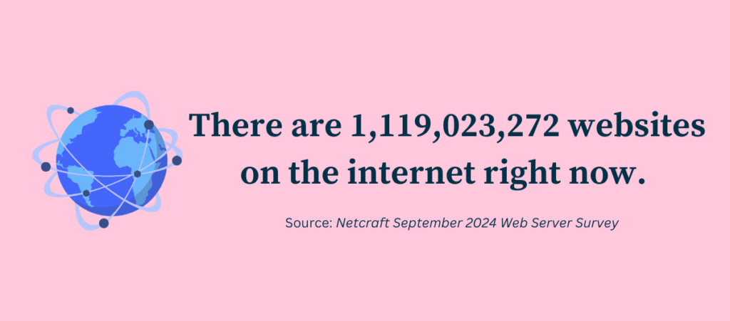
The internet is a wonderful place filled with millions and millions of websites. According to Curate Labs, as of 2025, there are more than 1.88 billion websites on the internet. With so many websites on the web, there are bound to be some terrible ones out there.
A website is an individual or business’s first impression. And first impressions are very important.
A bad website design doesn’t necessarily mean outdated design and boring content. Poor usability and responsiveness are also a major factor in determining how good a website is.
So, here’s a list of the worst websites that I have come across in the year 2025. Take a look at them to better understand what makes these websites bad and how you can avoid making those same mistakes.
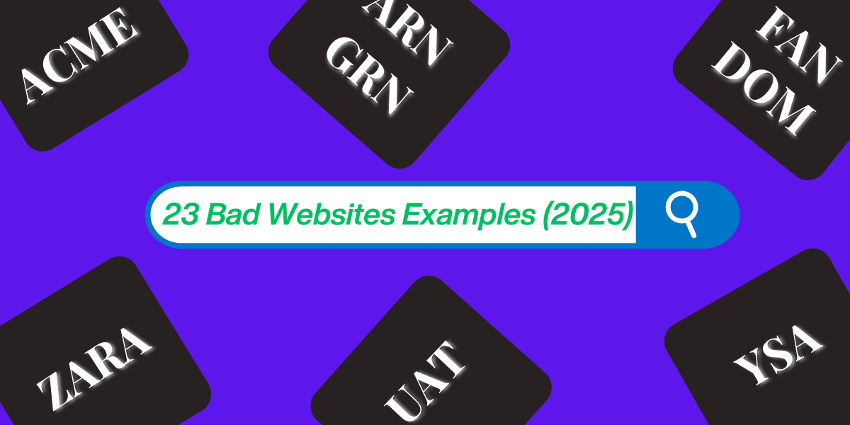
23 Bad Websites in 2025
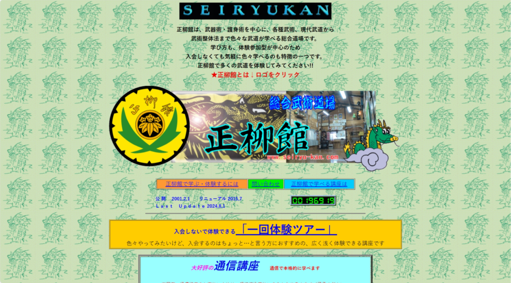
Japanese web design approach is both fascinating and peculiar, to say the least. For a country synonymous with minimalism, their web design philosophy is the complete opposite – focusing heavily on visual maximalism and convoluted style.
Seiryukan is among thousands of Japanese websites that still follow the old-school style of Japanese web design. The dojo’s website home page looks straight out of a 2000s Japanese movie, filled with a dense layout of texts and images. Also, the bright colours used and the background don’t exactly match well. Even the text in some parts of the website becomes illegible due to that background.
In case you want to learn more about why Japanese websites look the way they do, I suggest heading to Sabrinas.space and checking out this informative article.
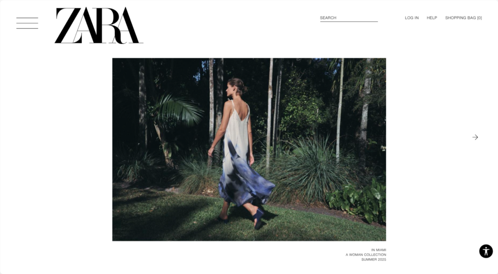
WHERE ARE THE CLOTHES???
You would think that a fast-fashion brand like Zara would know one or two things about building a proper home page, but unfortunately, that isn’t the case. Zara is notorious for having a website that is hard to navigate through. Navigation isn’t the only issue, though.
At first glance, the website resembles a modelling agency rather than something belonging to a clothing brand. Almost all product images on the official website focus more on the models than the products themselves. And it’s an issue emphasised by many users. All in all, Zara’s website is non-user-friendly and a navigation nightmare.
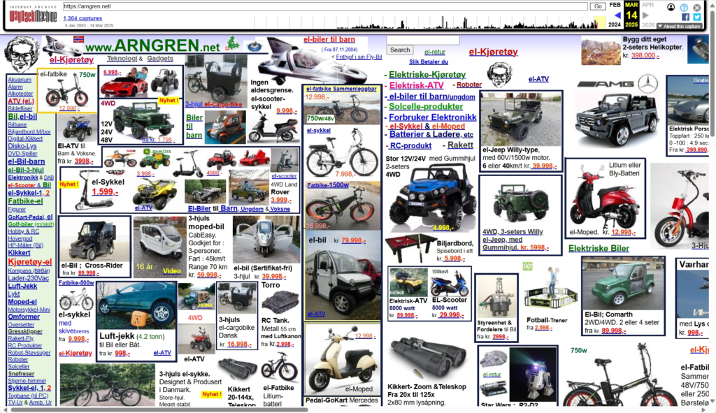
Arngren is a Norwegian webshop operating since 1983. Unfortunately, the website design has remained stuck to that same year. It’s the epitome of a poorly designed website and even they know it. In their About Us section, Arngren even mentions “We have received significant criticism for the design of their websites.”
The website is so cluttered and unorganized to the point that it can be overwhelming for some visitors. ARNGREN also lacks a menu or navigation bar, making it very difficult to browse the website. All in all, this website is a peak example of how not to design a website.
Bäckerei-Konditorei-Confiserie R.+M
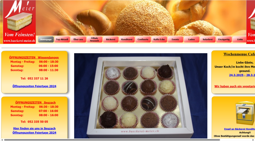
This one simply takes the cake (pun intended!) regarding having a bad website design. Designed by the owner, the Bäckerei Meier official website is a treasure trove of poor website design choices.
First of all, this website isn’t properly optimised at all. At present, more than 50% of website traffic comes from mobile. Having a mobile-optimized website isn’t just a need but a necessity. Unfortunately, per our tests, this website is atrocious to use on mobile. Furthermore, the multiple texts and image blocks packed so closely together make for a really appealing design. And that FREE WI-FI banner located above the footer is just hilarious. Why they needed to make such a large banner highlighting free Wi-Fi is beyond us.
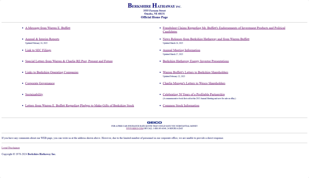
There’s Minimalism, and then there’s too much minimalism. While I agree it’s a completely workable website, it just doesn’t resemble a website operated by a company valued at $1 Trillion USD.
Visually, the website is extremely outdated. There’s no visual hook or appeal that will attract a visitor. The texts are too small on mobile, making them ineligible to read. The website has no assistive features, making it hard for individuals with disabilities to explore the site.
Something hilarious about the Berkshire Hathaway website is that Geico somehow got an ad in there.
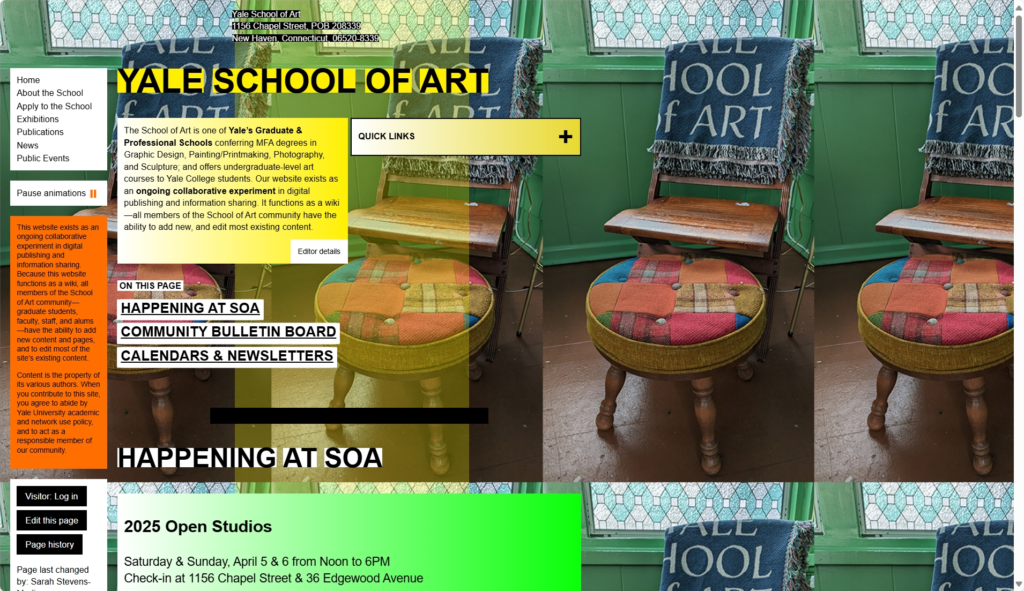
Disappointment doesn’t even begin to describe my first reaction to this website. The website is an “ongoing collaborative experiment in digital publishing and information sharing” and can be edited by any School of Art community member. It’s a fun experiment, to be sure, but the result, in all honesty, is simply a poorly designed website.
That strange background and the numerous text gradient blocks on the homepage make the website look like some fourth grader’s first website project. A prestigious institution like Yale School of Art having a website like this is just something else.
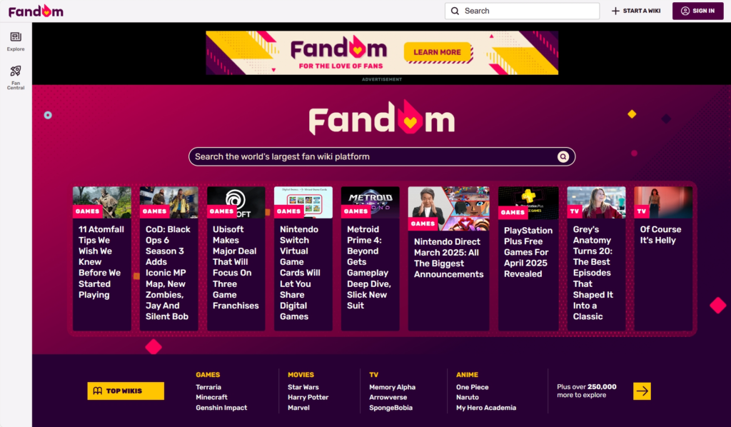
A few visits to any Fandom wiki and the hate for it will soon flow through you. One of the most egregious things about Fandom wikis is that every single wiki page on Fandom is filled to the brim with ads. The ad situation is so bad that many users have complained about video ads crashing their browsers. And if that wasn’t frustrating enough, the wiki pages also autoplay videos.
Fandom is a public wiki, meaning anyone can create an account and edit content there. As a result, the wikis hosted there are always under a constant threat of vandalism. Furthermore, the information provided in the wikis is also sometimes highly inaccurate. All in all, Fandom has one of the worst website design I have seen so far. No wonder most fandoms are actively trying to move their wikis from Fandom to other services like wiki.gg and Weird Gloop.

If I were to describe ACME in one word, it would be – boring. While it’s not on the list of worst website design I have seen so far, it certainly has the characteristics of terrible website design. There are few visual elements to hook users, which, mixed with that bland green background, makes for an unappealing website.
A major problem with Acme.com is that it is unclear what the website’s purpose is when you first take a quick look at it. A good web design shows its clear purpose and doesn’t take much for a user to know what it is about. On the other hand, a bad web design does nothing but confuse users, which Acme.com is a great example of.
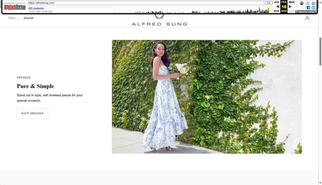
UPDATE: Alfred Sung recently redesigned their website. The following review was done when the old website was live. The redesigned Alfred Sung website looks much better compared to the old one, although it too has its own share of issues.

Alfred Sung is a Canadian fashion brand that has been crafting iconic dresses, watches, and other fashion apparel for over 40 years. Sadly, their website doesn’t really reflect that level of prestige and luxury. It’s a very basic Shopify store with next to no customisation.
The website is so bare that you can even see two empty featured blog posts in the carousel slider at the bottom. And if that wasn’t enough, even the navigation bar is completely empty except for a Journal button. There’s just too little content available on the website.
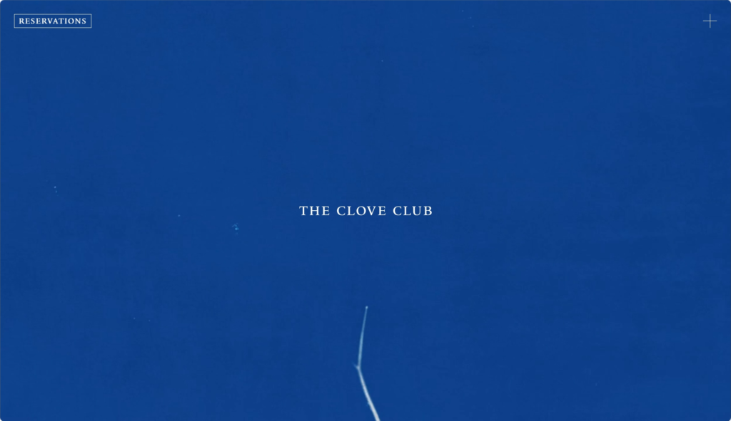
Your first visit to The Clove Club website will make you think that it is some kind of an art project rather than a website for a Two Michelin Star fine dining restaurant. Who in their right mind thought it would be better to devoid the home page of any meaningful content and instead put a video of a growing crop(?)? You are a Two Michelin Star restaurant. Put that on your homepage or show visitors the journey of your restaurant and so on.
The website also lacks proper SEO optimisation. Minimal text content limits keyword optimisation and makes it harder to rank in search engines. Moreover, the site can be made more engaging with the help of blogs, a news section highlighting the latest addition to the menu, videos of the dining experience and much more. The site also lacks accessibility support, as it has no visible alt text for images, contrast adjustments for visually impaired users, and more, making it a prime example of websites with bad accessibility.

Just wow. Just one visit to the website and you will immediately think that this website was made back in the 2000s. The use of that starry background, photos of Futuro Houses as borders, and inconsistent use of font colours exude a peak mid-2000s web design vibe.
When it comes to site responsiveness, it’s simply not there at all. I tested the website on three different browsers on mobile – Firefox, Brave and Chrome. In all three browsers, the images and gif don’t load at all. And since the starry background also doesn’t load, it results in the font becoming nearly ineligible to the naked eye because of the low contrast. And by the way,
P.S. – For more updated information on Futuro Houses, you can check out this website. This new recommended website too has some design issues but it’s far better than Future-House.net.
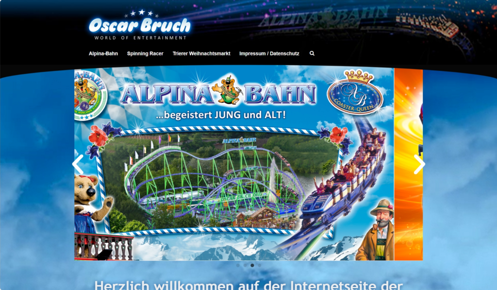
While the international website of Oscar Bruch is good, the German website is something else entirely. For starters, the website looks very boring. The design needs to feel more modern and visually appealing. Getting rid of that background and enhancing typography through high-contrast font colors and such would help a lot in improving this website.
Now this is just a personal nitpick but whoever is maintaining the website, please, for the love of God, use an image where that strange-looking bear mascot isn’t present.
The website lacks visual clarity. Switching to another font would help a lot in making this website eligible for visitors. More use of whitespace and simplifying the layout will significantly improve readability and focus. Furthermore, the website also suffers from information overload. There’s just too much information present and some of them aren’t even relevant. Removing unnecessary texts, using bullet points, proper capitalisation and such is the only solution to this information overload problem.
Also, why is the footer smackdab at the top of the homepage? Footers are supposed to be at the bottom of the page, not in the top. Overall, the website isn’t as bad as some of the other websites mentioned here but it’s also not particularly up to the standards of modern web design.

Justine’s Brasserie is a French-inspired restaurant in Austin, Texas, known for its late-night dining and vibrant atmosphere. And it shows in their website design too. Justine’s homepage certainly excels at showcasing the restaurant’s eclectic and unique ambience. However, it also poses a usability challenge to some visitors. The bold visuals used on the homepage, specifically the flashing images and unpredictable motion effects, could potentially trigger seizures or discomfort for individuals with photosensitive epilepsy or other sensory sensitivities.
Navigating the menu can be challenging for users unfamiliar with French terminology. The white font colour used blends in with the black-and-white visual of the homepage, making it hard to read properly sometimes.
Hate somebody? Want to annoy them?? Just ask them to navigate Cosmology.com and soon you will find them banging their head against a wall. Cosmology.com is a very simple website. In fact, it’s too simple. So simple that you can’t even navigate to any other page. If you want to get to another page of the website, you will have to manually type in Cosmology. com (yes. There’s a space after the period) on the search bar and then click on the page you want to go to.
The content on the website is interesting, to say the least. But that’s not what I am here to talk about. Cosmology.com isn’t also particularly visually interesting. Rather, it appears very dull as it’s programmed with basic HTML and CSS. As for responsiveness on mobile, it’s not really bad somehow.
Currently, Cosmology.com is up for sale. The asking price? $50,000.
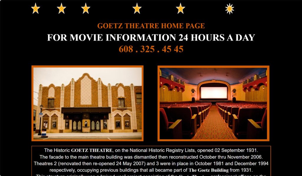
Goetz Theatre, are you trying to play hide and seek with your website visitors? While we know dark mode is all the rage right now, a light mode option would do wonders for this website. The home page is nothing short of strange. For whatever reason, the fourth image or video doesn’t load at all. I tried three browsers – Firefox, Microsoft Edge, and Chrome. That image/video simply refuses to load on all three of those.
That’s not even the worst part at all. If you go to the homepage of the Goetz Theatre, you will soon realise that it simply doesn’t have any navigation feature. For a good few seconds, I was scratching my head trying to find a way to head to another page of the website. It was only until I hovered over the top of the page and saw my mouse cursor change into the hand cursor that I realised there was a clickable object in there. And after I clicked on that object, the website finally led me to another page.
Along with navigation, the readability of the Goetz Theatre website is also a big issue. The current colour scheme and typography are not visually appealing at all. Moreover, the lack of contrasting colours, makes it specifically hard to read in some places. Switching to a more visually stunning colour scheme and a clean, readable font will improve the website by a mile. And of course, fixing that navigation issue is a must too.
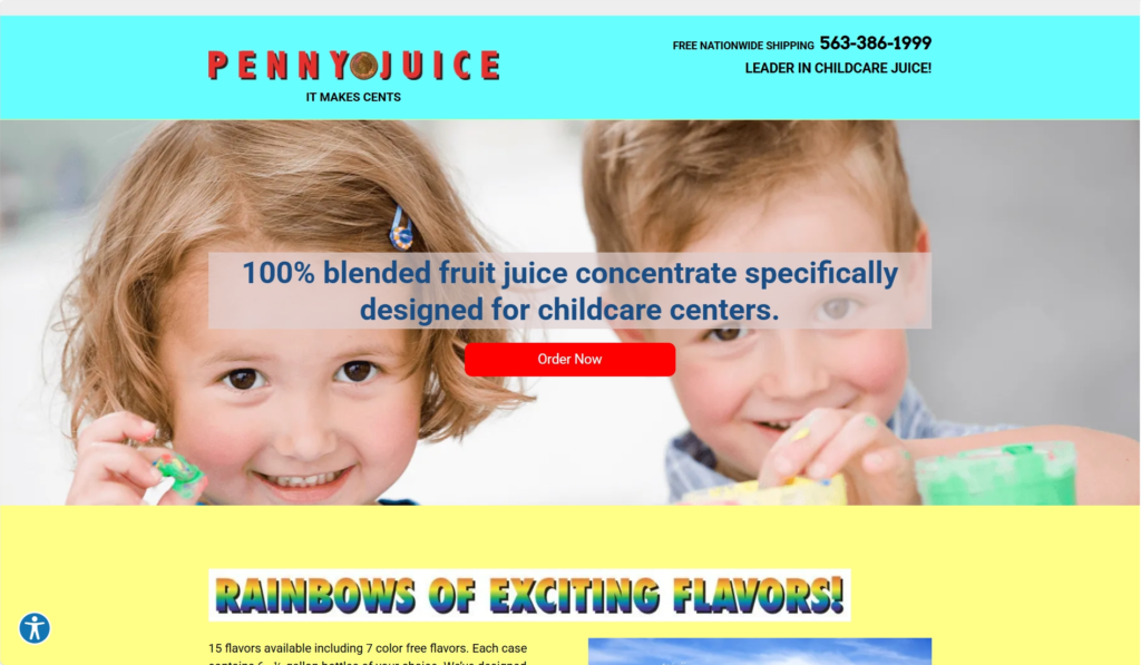
Penny Juice has a very outdated website design. Like many of the subjects mentioned in this list of poorly designed websites, the Penny Juice website appears highly outdated. Everything from the layout, colours and font used here makes the website look very amateurish. Since the target audience is childcare centres, a fun and colourful theme makes sense. However, the website should be designed in a more modern and structured way.
There’s also a need for easier navigation. Instead of clicking on buttons, a drop-down menu or even a simple navbar will help visitors navigate the website more easily. Other than that, using more fun, vibrant colours with a modern layout should suffice in making the website more visually pleasing.
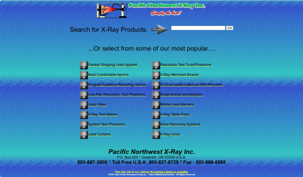
The Pacific Northwest X-Ray Inc. website has one of the worst web page designs I have come across so far. Its use of basic HTML coupled with no strong visual hierarchy shows just how terrible website design it has. The entire Pacific Northwest X-Ray Inc. website is text-heavy, with sparse use of interactive elements. Product listings especially are a victim of this issue. The addition of engaging visuals in the form of images and videos would add so much life to the website.
The colour theme choice is also questionable here. That blue background at times blends in with the black text, which in turn is quite hard to read at some places. Including a modern hero banner, updating the current typography, and adding better visual hierarchy are some of the suggestions that can help Pacific Northwest X-Ray Inc.’s website from not being included into someone else’s list of poorly made websites.

AAAAAAAAAAAAAA!! For the love of god, what is this website? It’s just texts upon texts upon texts upon texts. There’s simply next to no styling, no product images and on top of that no proper navigation. The website is nothing but an endless wall of text. Whoever designed this website, this is a sincere request. Please revamp it.
The website has no product filter or sorting option, making it a frustrating experience to browse for the product you need. Even just including a product image will do so much in improving the product browsing experience for buyers. And why is everything on the homepage itself? Why not make separate pages for products and other information?
No proper UI/UX elements, engaging visuals, or a modern layout – there are a lot of things missing here. No wonder it’s such a terrible website to shop and browse for Atari products.
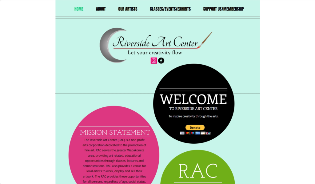
The Riverside Art Center website suffers from the same issue as Yale School of Art’s website. An art-focused business or institution ought to have a website that features great art and visuals. The homepage of Riverside is so bland and boring that it makes me wonder if whoever designed the website even tried to use some creative effort at all.
The navigation bar also lacks the interactivity that you come across on modern websites. The navbar just straight-up disappears when you switch to another webpage after clicking on one of the options. There’s simply no other way to go back to the homepage other than to use the back button on your browser. Furthermore, there’s also a major issue on the homepage. It looks like the element above the footer has been used twice. And for some reason, this issue hasn’t been corrected yet.
Meh – that’s the first word that came to my mind when I first saw this website. The strange logo, unorganized layout and typography, all add up to make a website that’s just uninteresting to look at.
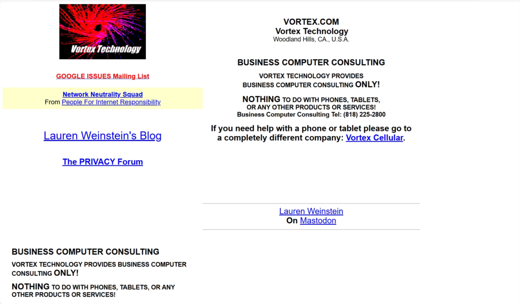
People need to know that it is entirely possible to make a simple website that does not suck. Even websites made with basic HTML can look good. Honestly, the Vortex Technology website needs a redesign. A navigation bar along with a new organized design layout would make the website look so much better.
University of Advancing Technology
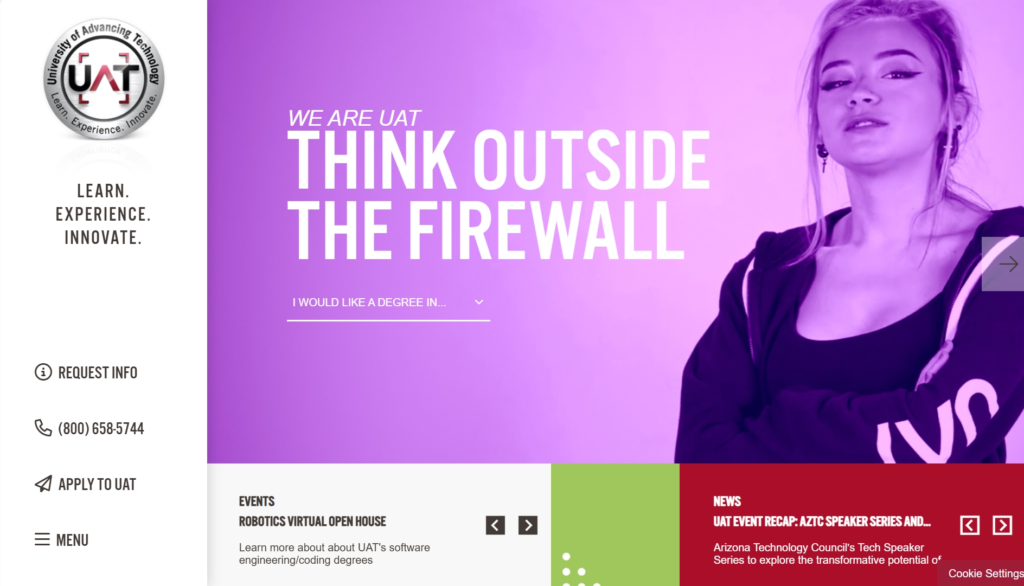
This is such a confusing website. A university homepage should be simple and filled with proper information for the students and staff. However, it seems like the University of Advancing Technology had other opinions regarding this. The video on the homepage is quite distracting. Moreover, it would’ve been much better if the navbar was on the top of the page rather than on the side. There are just too many animations and effects going on the website which makes the browsing experience rather cumbersome.
Even on mobile, the website suffers from some major issues. First of all, the website isn’t mobile responsive at all. It’s also not aligned properly. It also has a loading problem. Currently, pages take a considerable amount of time to load which might be due to excessive use of animations and effects as mentioned before. To be honest, the University of Advancing Technology website isn’t the most terrible website design we’ve come across so far. Just a few changes and it will look and work better than ever before.


Patimex is a Polish charcoal company that primarily serves wholesalers and large customers. In the past, it had a pretty bad website. And as a result, it was heavily featured in worst website design articles like this. You can still check out the old Patimex website here if you want.
Currently, Patimex has a new website that’s much better than the last one. But is it good? Well, only somewhat. The new Patimex website still has a few major issues that need to be taken care of. For starters, the navigation bar isn’t properly designed. All four options in the navbar should have an equal amount of spacing between them and not be close to each other at all.
The product images in the Offer section can also be improved. Similarly, the homepage can also be better. Adding more informational content and linking anchor texts to proper pages are things that will be of big help in refining the current Patimex website.
How To Avoid Making A Bad Website
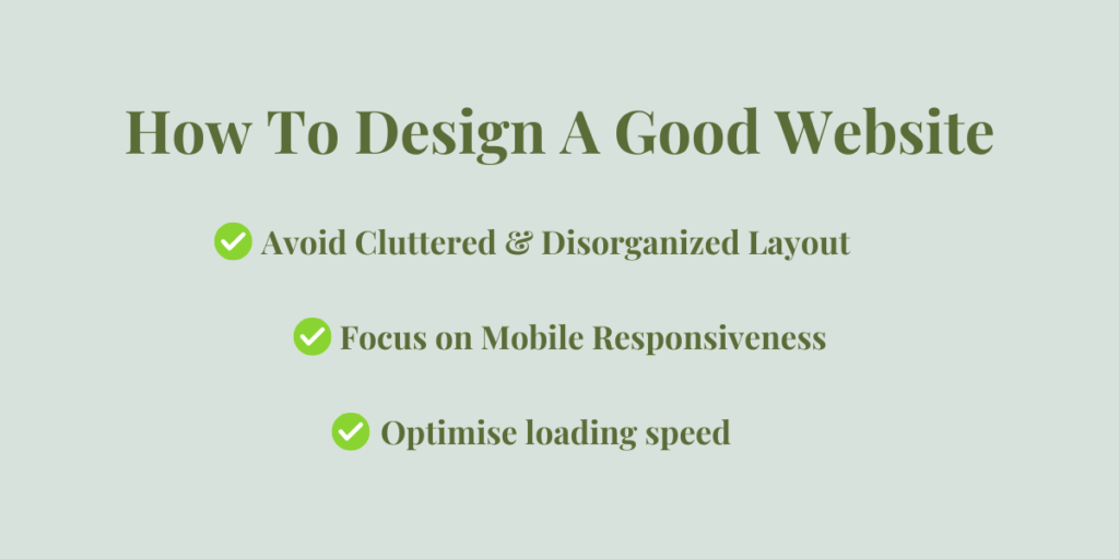
Focus on Mobile Responsiveness
63% of internet traffic comes from mobile. To ignore such a major platform is nothing but stupidity. When designing a website, make sure that it is mobile responsive. If you don’t and your website ends up looking terrible on mobile then you’ve got no one to blame but yourself.
Avoid Cluttered & Disorganized Layout
A website with too many elements crammed together is going to make it hard to navigate and overwhelming too. And you don’t want to overwhelm users. Go for a clearly structured layout, proper content hierarchy and use whitespace. Also, make sure that your hero section conveys your brand image and isn’t crowded with too much unnecessary information or elements.
Optimise loading speed
Websites with slow loading speeds have the highest bounce rates. Why? It’s simple. No user is going to wait and waste their time waiting for a website to load.
Plus with attention spans getting shorter, it’s important for developers to focus on making their websites as fast as possible. In order to optimise your loading speed, use CDN (Content Delivery Network) for faster global access, remove unnecessary scripts and reduce image and video sizes.
You can also use tools like PageSpeed Insight to check your website performance. Aim for anything between 90-100. A score lower than 90 means, you need to improve your website.
Conclusion
So, now that you have looked at the websites mentioned in this list of the top twenty-three worst website examples, can you find any similarities between them and your website? If yes, then a refresh and adjustments are due for the course.
You can also reach out to Dectox IT Solutions and get your website issues sorted out in an efficient and cost-effective manner.
Leave a Reply