In the age of smartphones and tablets, your audience is more likely to discover your website on a mobile device than a desktop. According to Google, more than 60% of web traffic now comes from mobile users. This shift in user behavior has made Mobile-First Design not just a recommendation — but a requirement for online success.
Whether you’re a local business, doctor, startup, or e-commerce brand in Chennai, understanding the importance of mobile-first design can transform your digital presence, SEO rankings, and ultimately your conversion rates.
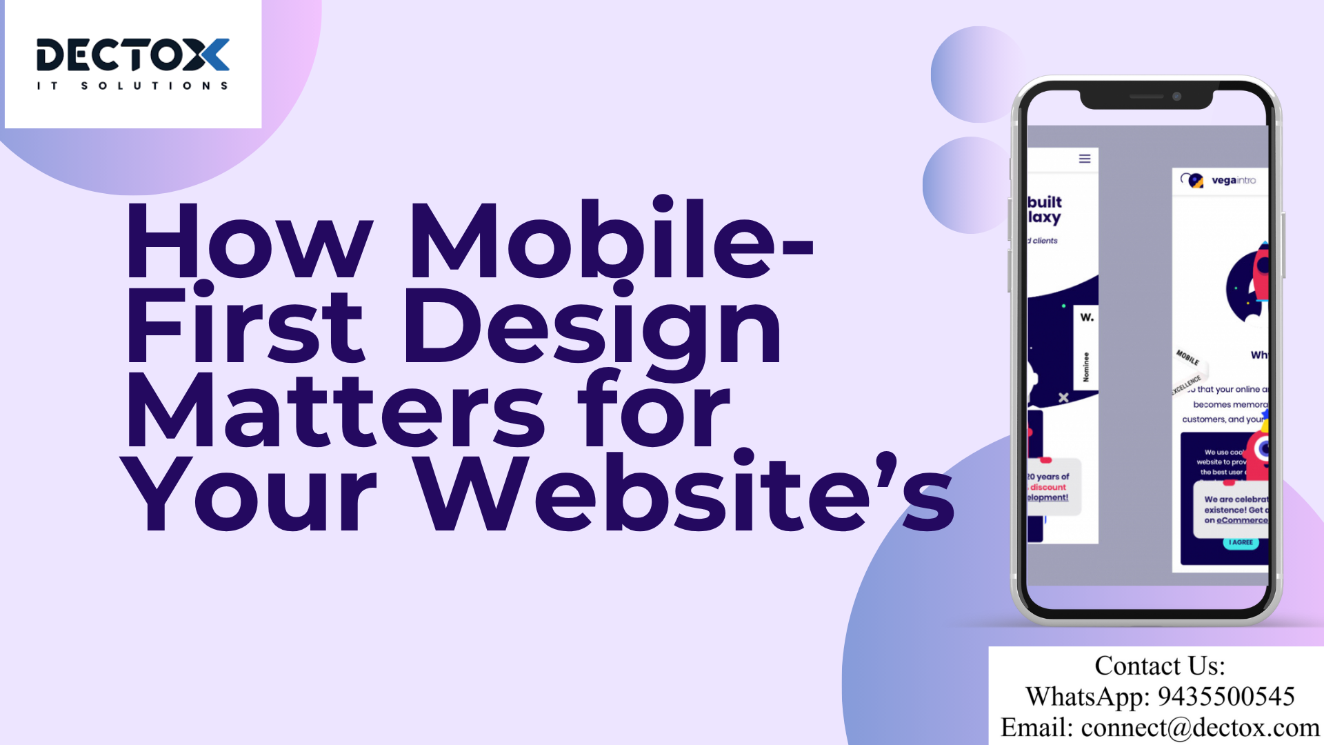
At Dectox IT Solutions, we specialize in crafting mobile-first, high-performance websites that are built to impress on any device and screen size.
📱 What is Mobile-First Design?
Mobile-first design is a design approach where websites are initially crafted for smaller screens like smartphones and then scaled up for tablets and desktops. It flips the traditional model — instead of adapting a desktop site for mobile, it starts with mobile as the primary experience.
Why is this approach so effective?
- Mobile users are task-oriented
- Mobile-first websites load faster
- Better performance across all devices
- Improved Google rankings due to mobile-first indexing
📈 Google’s Mobile-First Indexing – What You Need to Know
Since 2018, Google has prioritized the mobile version of websites for ranking and indexing. This means:
If your mobile website is poorly designed or loads slowly, it can affect your entire site’s SEO — even on desktop searches.
That’s why mobile-first isn’t just a design choice. It’s an SEO strategy.
💡 Benefits of Mobile-First Web Design
Let’s explore why mobile-first design is essential for your business website:
1. ✅ Enhanced User Experience (UX)
Mobile-first websites are optimized for:
- Thumb navigation
- Minimalist design
- Clear CTAs
- Fast interactions
This leads to a better experience for users on smartphones — where attention spans are shorter and expectations are higher.
2. 📱 Faster Load Times
Mobile-first design often removes unnecessary elements, resulting in:
- Fewer HTTP requests
- Optimized images
- Lightweight code
Speed = Higher engagement + SEO boost
3. 🔍 Higher SEO Rankings
Mobile responsiveness, speed, and usability are ranking factors in Google’s algorithm. A mobile-first website gives you a competitive edge in organic search.
4. 📊 Increased Conversion Rates
Websites that load fast and are easy to navigate on mobile see significantly higher conversion rates. Especially for:
- Doctors offering online appointments
- E-commerce brands selling products
- Local service businesses
5. 📉 Reduced Bounce Rates
Mobile-first designs are tailored for the on-the-go user. If your website loads slowly or is hard to use, users will bounce — hurting your engagement metrics and SEO.
🔧 Key Principles of Mobile-First Design
Here’s what our development team at Dectox focuses on while building mobile-first websites:
● Prioritize Core Content
Content must be concise, scannable, and to the point. Mobile users don’t want to scroll endlessly.
● Use Scalable, Responsive Layouts
We use responsive CSS frameworks like Tailwind and Bootstrap to ensure smooth scaling across devices.
● Optimize Navigation
Menus should be:
- Easy to tap
- Sticky for easy access
- Simplified to avoid clutter
● Touch-Friendly Interactions
Buttons must be spaced properly to avoid accidental taps. We design for fingers, not cursors.
● Reduce Heavy Elements
We avoid overloading mobile pages with sliders, popups, or large media files — keeping it clean and fast.
🏆 Why Mobile-First Design is Ideal for Chennai-Based Businesses
As one of the fastest-growing digital markets in India, Chennai is seeing massive smartphone penetration. Businesses that adopt mobile-first websites enjoy:
- Better local search visibility
- Improved user engagement
- Increased leads and appointments
- Higher return on investment
Whether you’re building a clinic website, shopify eCommerce store, or business portfolio, Dectox helps you lead the mobile era.
Explore our full offerings:
👨💻 How Dectox Builds Mobile-First, SEO-Ready Websites
We follow a user-first and SEO-centric approach from the ground up:
| Feature | Included in Every Website |
|---|---|
| Mobile-first wireframes | ✅ |
| Responsive design testing | ✅ |
| Page speed optimization | ✅ |
| SEO meta tags + schema | ✅ |
| CMS integration (WordPress/Shopify) | ✅ |
| Google Analytics & Search Console | ✅ |
💬 Looking for a mobile-first website that performs?
📞 Contact us today or chat on WhatsApp 9435500545
📊 Real-World Impact of Mobile-First Design
🏥 Case Study: Clinic Website in Chennai
We built a mobile-first website for a Chennai-based dental clinic. Results in 3 months:
- 68% increase in mobile visits
- 3x increase in appointment bookings
- 45% reduction in bounce rate
- Top 3 Google rankings for “best dentist in Chennai”
This is the power of mobile-first + SEO + UX design — delivered by Dectox.
🙋 Frequently Asked Questions (FAQs)
❓ What is the difference between responsive and mobile-first design?
Responsive design adjusts to different screen sizes, but mobile-first starts with the mobile layout and scales up. It’s more performance-driven and user-centric.
❓ Does Google penalize non-mobile-friendly websites?
Yes. Google prefers mobile-optimized websites and ranks them higher. Poor mobile usability may lead to lower rankings, especially in mobile search results.
❓ Is mobile-first design only for small businesses?
Not at all. Mobile-first is essential for businesses of all sizes, especially in mobile-first markets like India. Even global brands like Amazon and Flipkart follow this approach.
❓ How do I know if my website is mobile-first?
Use tools like:
- Google Mobile-Friendly Test
- Google PageSpeed Insights
Or simply request a free audit from Dectox
❓ How much does it cost to build a mobile-first website?
Depending on features, platform, and complexity, mobile-first websites in Chennai typically start from ₹15,000 and go upward. Get a free quote from Dectox
✍️ Final Thoughts
In a mobile-dominated world, your website’s first impression is most likely on a phone screen. A mobile-first design ensures that impression is fast, functional, and effective — boosting both SEO rankings and user satisfaction.
“If your website doesn’t work well on mobile, it doesn’t work at all.”
🚀 Ready to build a mobile-first, SEO-friendly website for your business in Chennai or beyond?
📲 WhatsApp Us: 9435500545
📩 Email: connect@dectox.com
🌐 Visit: www.dectox.com
Leave a Reply